Despair quit talking like you understand everything because you have yet to make an "amazing" signature. To Wenduo, I'm going to break down each part that you need to work on.
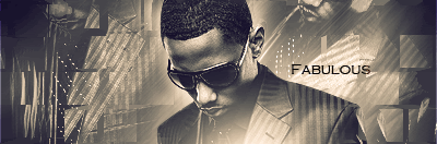
Text- Ruins the flow coming out of the center because its on the wrong slant going against the flow. The text is also a different color than everything on the signature so it makes the appeal more less.
Border-Make your border last so all the effects don't get compiled on top of it.
Effects: From what I can see you have some random brushes that are going against the flow and aren't of the same color scheme with the render so that makes the overall appeal again less. Stay away from brushes because right now your not at a level to know what all your tools do.
What else could you do to make this signature better:
Look at tutorials so you can get a sense of what looks good and what doesn't. Despair here may have looked at one or two but hasn't expanded beyond what he likes experimenting with in gimp (poopy lens flares, sparkle brush) so he will remain at his level until he steps up his game. Learn about smudging and blending and when your ready take a leap at lighting and C4Ds. Until then take the time to do every basic tutorial that you see regardless if it looks bad so you can get a feel for what looks good and what doesn't.
To Despair- Don't give any sass about calling you out because 90% of your work is worse than this signature.