|
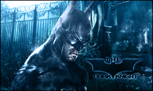
Latest sig again
|
|
|
| Eruption | Date: Sunday, 18 Apr 2010, 10:00 AM | Message # 1 |
 Part-Timer
Messages: 130
Load ...
Status: Offline
| Well i tried working on the stuff you guys told me and i think this is my best one out of ALL i made  well here it is. well here it is. 

Message edited by Eruption - Sunday, 18 Apr 2010, 10:01 AM |
| |
| |
|
| AtomicFlame | Date: Sunday, 18 Apr 2010, 12:58 PM | Message # 2 |
 Full-Timer
Messages: 468
Load ...
Status: Offline
| The color scheme is solid but I think you should blend the render in more with the background. When we say "blend" we sometimes talk about smudging it along the sides and or adding other things to the sig so that it adds depth. The text does'nt have to be on an angle like your previous sig. In a situation like this the text might look good horizontal with the proper text glows etc. I'm aware that your still a beginner and I'm not an expert by any means but I hope you take some of this advice.
Embedded vimeo videos will not play in HD because I don't have a paid account on vimeo. Click on the HD button to view the video in HD on vimeo's site if you so choose to do so. 

Message edited by AtomicFlame - Sunday, 18 Apr 2010, 2:35 PM |
| |
| |
|
| Eruption | Date: Sunday, 18 Apr 2010, 5:03 PM | Message # 3 |
 Part-Timer
Messages: 130
Load ...
Status: Offline
| i forgot about blending this lol. Added (18 Apr 2010, 5:03 PM)
---------------------------------------------
Ok heres the blending version... was a gud thingi still had it in gimp type


|
| |
| |
|
| AtomicFlame | Date: Sunday, 18 Apr 2010, 6:33 PM | Message # 4 |
 Full-Timer
Messages: 468
Load ...
Status: Offline
| Much better.
Embedded vimeo videos will not play in HD because I don't have a paid account on vimeo. Click on the HD button to view the video in HD on vimeo's site if you so choose to do so. 

|
| |
| |
|
| DoudyxXxDubs | Date: Sunday, 18 Apr 2010, 8:13 PM | Message # 5 |
 Legendary
Messages: 1010
Load ...
Status: Offline
| wow i just came, your v1 compared to your v2. The subtle things like blending and good text placement, make the difference between a good sig and a bad sig. Lovin the V2 definitely your best dude. Keep looking up tuts, and picking up new styles as you go.

|
| |
| |
|
|
| zAk | Date: Sunday, 18 Apr 2010, 9:06 PM | Message # 7 |
 Acquaintance
Messages: 38
Load ...
Status: Offline
| Not bad smudging.


|
| |
| |
|
| Eruption | Date: Sunday, 18 Apr 2010, 10:56 PM | Message # 8 |
 Part-Timer
Messages: 130
Load ...
Status: Offline
| Thnx guys  i spent like an hour on these and like 20 min looking for the right brushes lol. but i think i placed the text the wrong place for v2. i spent like an hour on these and like 20 min looking for the right brushes lol. but i think i placed the text the wrong place for v2.  but next time ill know where to put it but next time ill know where to put it 

Message edited by Eruption - Sunday, 18 Apr 2010, 10:57 PM |
| |
| |
|
| zAk | Date: Monday, 19 Apr 2010, 10:38 AM | Message # 9 |
 Acquaintance
Messages: 38
Load ...
Status: Offline
| lol..Don't worry how long they take. Sometimes good stuff takes hours, sometimes minutes. depends on what your doing. My samus one took about 3 hours. But kayne took about 30 mins. See what I mean?


Message edited by zAk - Monday, 19 Apr 2010, 10:39 AM |
| |
| |
|
| Eruption | Date: Monday, 19 Apr 2010, 4:59 PM | Message # 10 |
 Part-Timer
Messages: 130
Load ...
Status: Offline
| yea i know but it took me this long cuz i wasnt sure what stuff you put in or use but if i do this all over again, i estimate about 20 min . mayb less

|
| |
| |