|
Possibly my best sig ever?
|
|
|
| Warhero | Date: Tuesday, 29 Jun 2010, 11:34 PM | Message # 1 |
 Newbie
Messages: 14
Load ...
Status: Offline
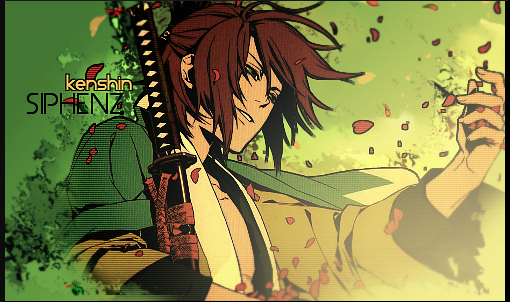
| On my ps3 clan's website someone requested a sig, and this is what I came up with. I think it's pretty good, but I'm sure you guys can tear a few big holes in it. So how about it? Bring on the criticism  : : 

|
| |
| |
|
| Mariah | Date: Tuesday, 29 Jun 2010, 11:42 PM | Message # 2 |
 Distinguished
Messages: 666
Load ...
Status: Offline
| only thing I don't really like about it is the text, but other that that I like it a lot War. I like your panda sig better though. 
 

Thanks DoudyxXxDubs for the awesome b-day sig!
|
| |
| |
|
| Warhero | Date: Wednesday, 30 Jun 2010, 1:57 AM | Message # 3 |
|
Newbie
Messages: 14
Load ...
Status: Offline
| He requested that I make the text big, so I did, but I'm sure I still could've made that better. Any reccomendations for text? It's always been one of the weakest elements of my signature making. Also, does anyone know a good site to get brushes besides deviantart? I only have 4 sets of brushes besides the default ones, and I think that limits me. And thank you. I like the panda sig too.
Message edited by Warhero - Wednesday, 30 Jun 2010, 2:02 AM |
| |
| |
|
| DoudyxXxDubs | Date: Wednesday, 30 Jun 2010, 2:45 AM | Message # 4 |
 Legendary
Messages: 1010
Load ...
Status: Offline
| Yeah its pretty good, nuthin flashy tho. PANDA FTW!!!!!!!!!!!!!!!

|
| |
| |
|
| Mariah | Date: Wednesday, 30 Jun 2010, 3:16 AM | Message # 5 |
|
Distinguished
Messages: 666
Load ...
Status: Offline
| oh no, I'm not complaining about the size of the text, just the choice. This website has some pretty good brushes as well as stocks and textures: http://www.brusheezy.com/ Always try to make the text very close to the focal point. Otherwise it creates two focal points. Just try out some different texts and eventually you'll find some that you're pretty comfortable with.
Thanks DoudyxXxDubs for the awesome b-day sig!
|
| |
| |
|
| Zexies | Date: Wednesday, 30 Jun 2010, 4:31 AM | Message # 6 |
 Part-Timer
Messages: 112
Load ...
Status: Offline
| i only used the default brushes once i got used to photoshop lol

my heart belongs with my sanity. because both restrict who i can become
|
| |
| |
|
| Dbl-Trbl | Date: Saturday, 03 Jul 2010, 3:48 PM | Message # 7 |
|
Newbie
Messages: 13
Load ...
Status: Offline
| cool sig
really like it
[IMG]http://i878.photobucket.com/albums/ab349/HIKOMASHU/GiMP%20stuff/Unti.png[/IMG]
|
| |
| |
|
| Tiachi | Date: Saturday, 03 Jul 2010, 4:06 PM | Message # 8 |
|
Newbie
Messages: 7
Load ...
Status: Offline
| I like it better than the panda sig 
|
| |
| |
|
| Siphenz | Date: Saturday, 03 Jul 2010, 6:47 PM | Message # 9 |
 The Hitokiri
Messages: 384
Load ...
Status: Offline
| nice texture to it text would look better blended overall pretty good, but i still like your panda sig better too lol
|
| |
| |
|
| Denial | Date: Sunday, 04 Jul 2010, 11:49 AM | Message # 10 |
 Full-Timer
Messages: 305
Load ...
Status: Offline
| its looks good. I like it
|
| |
| |


