|
Sasuke
|
|
|
| Eruption | Date: Wednesday, 27 Oct 2010, 9:39 AM | Message # 1 |
 Part-Timer
Messages: 130
Load ...
Status: Offline
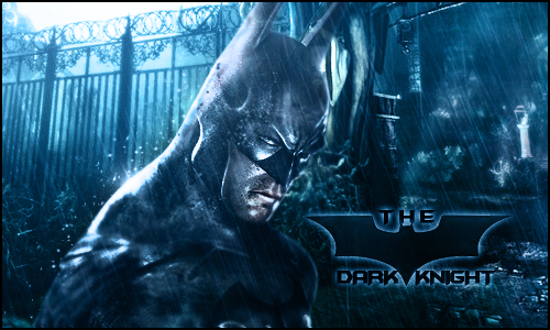
| Wanted to whore some anime 

For those who cant read the text, it says Enajii

Message edited by Eruption - Wednesday, 27 Oct 2010, 9:42 AM |
| |
| |
|
| DoudyxXxDubs | Date: Wednesday, 27 Oct 2010, 12:07 PM | Message # 2 |
 Legendary
Messages: 1010
Load ...
Status: Offline
| I like this one erupt, but I don't hoe you covered his head a little bit, on the shirt it's good, but the head I don't like. And text shouldn't be purple imo. should be a whitish blue. gj tho erupt. keep it up.
|
| |
| |
|
| Siphenz | Date: Wednesday, 27 Oct 2010, 1:45 PM | Message # 3 |
 The Hitokiri
Messages: 384
Load ...
Status: Offline
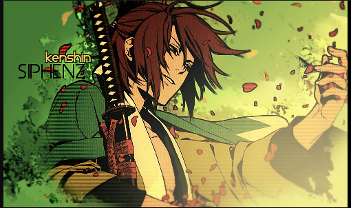
| Get rid of the graphic on the left or put it behind him... idky you people keep putting 2 focals in there
|
| |
| |
|
| Eruption | Date: Wednesday, 27 Oct 2010, 3:37 PM | Message # 4 |
 Part-Timer
Messages: 130
Load ...
Status: Offline
| It is behind him Sinister. In my opinion, the render makes the illusion that it is too. And I can fix all those things Spidey told me (or atleast attemp) since i have it on gimp format also  Here it is


Message edited by Eruption - Wednesday, 27 Oct 2010, 3:47 PM |
| |
| |
|
| DoudyxXxDubs | Date: Wednesday, 27 Oct 2010, 4:07 PM | Message # 5 |
 Legendary
Messages: 1010
Load ...
Status: Offline
| A little better. Bring the text a little away from the render.

|
| |
| |
|
| Siphenz | Date: Wednesday, 27 Oct 2010, 4:20 PM | Message # 6 |
 The Hitokiri
Messages: 384
Load ...
Status: Offline
| No... I mean put it actually behind the render. Not under the render layer over to the left side of the sig. That graphic is killing the flow...

|
| |
| |
|
| Eruption | Date: Wednesday, 27 Oct 2010, 4:24 PM | Message # 7 |
 Part-Timer
Messages: 130
Load ...
Status: Offline
| I motioned the graphic to flow with the sig.

|
| |
| |
|
| Siphenz | Date: Wednesday, 27 Oct 2010, 4:25 PM | Message # 8 |
 The Hitokiri
Messages: 384
Load ...
Status: Offline
| Flow is not just direction... it can also be texture. ;]

|
| |
| |
|
| soul | Date: Wednesday, 27 Oct 2010, 6:57 PM | Message # 9 |
 Part-Timer
Messages: 124
Load ...
Status: Offline
| well that t hing bottom left is EXTREMELY distracting i say smudge the phuck out if for some texture like sinny said but make it flow to but yeah or just get ride of it 
|
| |
| |
|
| IKilledYou | Date: Wednesday, 27 Oct 2010, 7:08 PM | Message # 10 |
 Full-Timer
Messages: 381
Load ...
Status: Offline
| meh....


|
| |
| |