Thursday, 25 Apr 2024, 10:54 AM | Welcome Guest

[ New messages · Members · Forum rules · Search · RSS ]
  • Page 1 of 1
  • 1
Forum » Showrooms » GFX Show Off » asian girl
asian girl
IKilledYouDate: Sunday, 02 May 2010, 6:13 PM | Message # 1
Full-Timer
Messages: 381
Load ...
Status: Offline


WarheroDate: Sunday, 02 May 2010, 6:49 PM | Message # 2
Newbie
Messages: 14
Load ...
Status: Offline
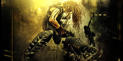
Wow... Did you follow a tut? If not, could you make one? That is one of the sig styles I've been trying to learn because I think it's so awesome.

Good lighting, blending, and flow. The text placement and effects seem appropriate (they don't ruin anything, in fact they add to the sig). C4d's add flow. My only complaint would be that the very edges of the sig seem too plain, but I can't think of a way to add to it without ruining the flow of the sig. Maybe you could darken them a little more to add more depth and draw the eye to the focal more while hopefully making them look less plain.


IKilledYouDate: Sunday, 02 May 2010, 7:15 PM | Message # 3
Full-Timer
Messages: 381
Load ...
Status: Offline
sure ill make a tut for it and ill try some of that thanks


DoudyxXxDubsDate: Sunday, 02 May 2010, 9:31 PM | Message # 4
Legendary
Messages: 1010
Load ...
Status: Offline
I dont like the sharp c4d's you have goin on...I feel like you could have used a more appropiate c4d or placed the current one better. Nothing really else to critique.

 
GMANDate: Wednesday, 05 May 2010, 11:13 AM | Message # 5
Newbie
Messages: 18
Load ...
Status: Offline
too plain on the sides you should darken them up so it draws attention to the focal but very eye catching


My friends call me G
 
Forum » Showrooms » GFX Show Off » asian girl
  • Page 1 of 1
  • 1
Search:

Group Legend: [Administrator] [Moderator] [Member] [Banned]