|
My first!
|
|
|
| Volt | Date: Tuesday, 20 Jul 2010, 11:14 AM | Message # 1 |
 Regular
Messages: 81
Load ...
Status: Offline
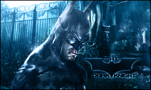
| I made a signature today because after i saw spideys i wanted to make one soo bad. It's thee bottom one, please tell me what you think!
|
| |
| |
|
| AtomicFlame | Date: Tuesday, 20 Jul 2010, 11:55 AM | Message # 2 |
 Full-Timer
Messages: 468
Load ...
Status: Offline
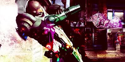
| Its not bad for being your first sig. We've seen plenty worse on Dragon GFX caugh.. Headshot  . .
Render placement could be changed and text placement could be changed to improve this. For a first not bad. Your clan tag isn't really necessary here. I'll ask for one of the admins to change it to Volt if thats alright with you. Oh and welcome to the site.
Embedded vimeo videos will not play in HD because I don't have a paid account on vimeo. Click on the HD button to view the video in HD on vimeo's site if you so choose to do so. 

|
| |
| |
|
| Volt | Date: Tuesday, 20 Jul 2010, 4:03 PM | Message # 3 |
 Regular
Messages: 81
Load ...
Status: Offline
| Well i have a uneet profile with my tag so thats why i have it here. btw where should i put the render then?
like this one more? 
i think i like this more though 

Message edited by Volt - Tuesday, 20 Jul 2010, 7:06 PM |
| |
| |
|
| Berserk | Date: Tuesday, 20 Jul 2010, 5:10 PM | Message # 4 |
|
Acquaintance
Messages: 28
Load ...
Status: Offline
| u see how ur render cuts off at the bottom? well dont let that happen like ur 1st ever sig^. u put it where in the right place where u cant see its cut off(if u know wut im talkin about)unlike the other one where u can see it cuts off.
|
| |
| |
|
| DoudyxXxDubs | Date: Tuesday, 20 Jul 2010, 6:23 PM | Message # 5 |
 Legendary
Messages: 1010
Load ...
Status: Offline
| hey volt! welcome to the site. If you want to start makin sigs, start by looking at the tutorials here and pick up some stuff and some techniques. What program did you use volt?
|
| |
| |
|
| Volt | Date: Tuesday, 20 Jul 2010, 6:55 PM | Message # 6 |
 Regular
Messages: 81
Load ...
Status: Offline
| i used gimp 2.6.10

|
| |
| |
|
| BlitzKrieg | Date: Tuesday, 20 Jul 2010, 7:43 PM | Message # 7 |
 Full-Timer
Messages: 311
Load ...
Status: Offline
| I got that too.
Smudgies <3


|
| |
| |
|
| Volt | Date: Tuesday, 20 Jul 2010, 9:02 PM | Message # 8 |
 Regular
Messages: 81
Load ...
Status: Offline
| Yup berserk i was in a hurry so i probably not gonna use it anyway thanks fir the advice...
like this one?


Message edited by Volt - Tuesday, 20 Jul 2010, 9:48 PM |
| |
| |
|
| DoudyxXxDubs | Date: Tuesday, 20 Jul 2010, 10:18 PM | Message # 9 |
 Legendary
Messages: 1010
Load ...
Status: Offline
| Hmmm the basic feel of your sigs is two focal points, maybe even 3, and you only want 1. Right now your kinda just slappin on the render and makin the background separate, bu what you want to do in the future, is work around your placed render and make him in an atmosphere that suits him, so it looks like he is "in" the sig not on top of it. Hope you can understand that.

|
| |
| |
|
| Volt | Date: Tuesday, 20 Jul 2010, 10:21 PM | Message # 10 |
 Regular
Messages: 81
Load ...
Status: Offline
| sso you still like the one that it looks like hes in space?

|
| |
| |
|
| DoudyxXxDubs | Date: Wednesday, 21 Jul 2010, 11:52 AM | Message # 11 |
 Legendary
Messages: 1010
Load ...
Status: Offline
| i don't know which one that is....but probably not cause it is has to many focal points.

|
| |
| |