|
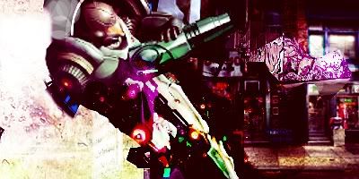
I <3 my new brushes lol
|
|
|
| Volt | Date: Tuesday, 10 Aug 2010, 6:09 PM | Message # 1 |
 Regular
Messages: 81
Load ...
Status: Offline
| 
I <3 brushes 

|
| |
| |
|
| Mariah | Date: Tuesday, 10 Aug 2010, 6:35 PM | Message # 2 |
 Distinguished
Messages: 666
Load ...
Status: Offline
| It's not bad, colors are good, however, try to stay away from having effects on the render. This can sometimes make your signature look low quality. Also remember with your text, try to place it closer to your render so it doesn't create 2 focal points. My eyes tend to go to the text and that's not good. Also with brushes, make sure your sigs don't just consist of brushing. You definitely want to include them if it's suitable, but make sure that that is not all your sig consists of. Keep on learning Volt 
 

Thanks DoudyxXxDubs for the awesome b-day sig!
|
| |
| |
|
| HIKOMASHU | Date: Wednesday, 11 Aug 2010, 1:34 AM | Message # 3 |
|
Full-Timer
Messages: 291
Load ...
Status: Offline
| l like it volt and what she said. 

|
| |
| |
|
| BlitzKrieg | Date: Wednesday, 11 Aug 2010, 1:56 AM | Message # 4 |
 Full-Timer
Messages: 311
Load ...
Status: Offline
| Most of my sigs just use different brushes and stocks.
and smudging.
lots and lots of smudging.
Smudgies 
Smudgies <3


|
| |
| |
|
| Volt | Date: Wednesday, 11 Aug 2010, 6:48 AM | Message # 5 |
 Regular
Messages: 81
Load ...
Status: Offline
| @Blitz me too lots of smudging lol, this sig was basicall just testing them out because i just go these.

|
| |
| |