Friday, 29 Mar 2024, 9:02 AM | Welcome Guest

[ New messages · Members · Forum rules · Search · RSS ]
  • Page 1 of 1
  • 1
Forum » Showrooms » GFX Show Off » 2 new sigs
2 new sigs
VoltDate: Sunday, 29 Aug 2010, 6:39 PM | Message # 1
Regular
Messages: 81
Load ...
Status: Offline
which do you like better?
I modified this one:

this is spidey biggrin


AtomicFlameDate: Sunday, 29 Aug 2010, 7:48 PM | Message # 2
Full-Timer
Messages: 468
Load ...
Status: Offline
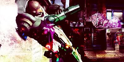
Knight- I almost liked the first version better. Having the darker side made it look like the left had lighting and that it was casting across the sig. The colors on the right side are more greener than the ones on the right when in the other version they were more blended in. Other than changing the text and brightening the right side I see no difference. Also you did not take my advice about the border. bash

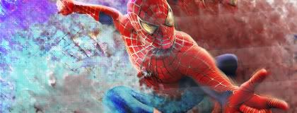
Spider-Man- Choose a color scheme and try to avoid having too many colors unless your going for a rainbow effect. With that said, my personal advice, change the left side's purple and light blue to a dark red and white like the other side. This will make the render blend better and will appeal to the eyes better.


Embedded vimeo videos will not play in HD because I don't have a paid account on vimeo. Click on the HD button to view the video in HD on vimeo's site if you so choose to do so.


Forum » Showrooms » GFX Show Off » 2 new sigs
  • Page 1 of 1
  • 1
Search:

Group Legend: [Administrator] [Moderator] [Member] [Banned]