|
Pein
|
|
|
| DoudyxXxDubs | Date: Thursday, 02 Sep 2010, 3:04 AM | Message # 1 |
 Legendary
Messages: 1010
Load ...
Status: Offline
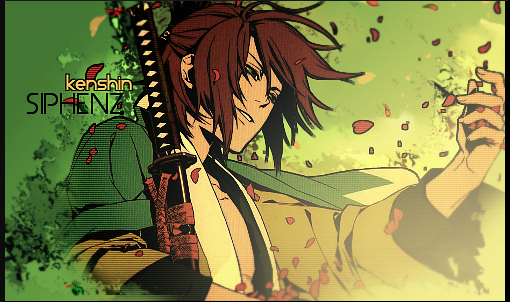
| Tried to go with a simple looking stock, tried to focus more on lighting. The lighting went through a lot of changes, but I think the end result turned out pretty good.  P.S. I like how you center your posts Jigs, so I'm stealing it.

|
| |
| |
|
| MrJiggles | Date: Thursday, 02 Sep 2010, 4:53 PM | Message # 2 |
 Full-Timer
Messages: 430
Load ...
Status: Offline
| Haha i all ways make it look more pro imo lol
I think the lighting is really good the only thing that bothers me
is the text i think it is really stealing the focal from that dude there.
I trust everyone, just not the devil inside of them. 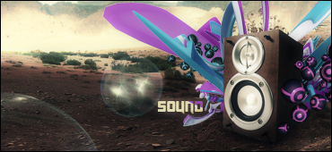
|
| |
| |
|
| Eruption | Date: Thursday, 02 Sep 2010, 5:12 PM | Message # 3 |
 Part-Timer
Messages: 130
Load ...
Status: Offline
| I like the lighting. text is in good place but the glow you gave it is just... bad, imo. other than that. i think it is a good-looking sig

|
| |
| |
|
| HIKOMASHU | Date: Thursday, 02 Sep 2010, 7:25 PM | Message # 4 |
|
Full-Timer
Messages: 291
Load ...
Status: Offline
| i like it.Lighting is good and its blended

|
| |
| |
|
| DoudyxXxDubs | Date: Thursday, 02 Sep 2010, 11:07 PM | Message # 5 |
|
Legendary
Messages: 1010
Load ...
Status: Offline
| thanks guys, I know the text steals the focal, but I really wanted it in there. So I just put it anyway. Thanks for the comments. 
|
| |
| |
|
| Siphenz | Date: Friday, 03 Sep 2010, 11:23 AM | Message # 6 |
 The Hitokiri
Messages: 384
Load ...
Status: Offline
| the lighting on the render is bad
lighting in the bg is good
text is... distracting, should try more subtle touch really not much else to comment on
|
| |
| |
|
| Denial | Date: Friday, 03 Sep 2010, 6:29 PM | Message # 7 |
 Full-Timer
Messages: 305
Load ...
Status: Offline
| The lighting and colors are wonderful, the text takes my eye away from the render though, but it's pretty good
|
| |
| |
|
| BOOGER | Date: Friday, 03 Sep 2010, 8:36 PM | Message # 8 |
|
Buddy
Messages: 62
Load ...
Status: Offline
| i think the text goes with the render to a T. and since there isnt a better real pein render out there i think it fits it perfect. looks good to me spidey. guess you have to watch the show in order to get it.
|
| |
| |
|
| DoudyxXxDubs | Date: Friday, 03 Sep 2010, 10:09 PM | Message # 9 |
|
Legendary
Messages: 1010
Load ...
Status: Offline
| yea...well it adds more to it, if you have watched it I think. But thanks for everyone's comments. I might be making another one for him, with more effects. I just wanted more of a subtle touch to this one. 
|
| |
| |


