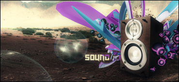
Sorry I've been busy. This is one of your better ones if you ask me but you did'nt really do what I advised you to do. I'm sorry for roughly editing your sig but for learning purposes I wanted you to get a better idea of what I was talking about:
Yours-
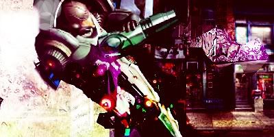
Mine-
I wanted you to make a light source and add shadows like this. I even through on a gradient map so the text would match the color scheme. All of this makes better appeal and overall blending better.
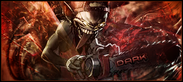
Make sure though that if you use a C4D or whatever those red splodges are that their edges are either smudged out or extended so you don't see the sharp edges like on the one on the right.