Thursday, 25 Apr 2024, 6:39 PM | Welcome Guest

[ New messages · Members · Forum rules · Search · RSS ]
  • Page 1 of 1
  • 1
Forum » Showrooms » GFX Show Off » okay guys (:O)
okay guys
soulDate: Thursday, 09 Sep 2010, 7:00 PM | Message # 1
Part-Timer
Messages: 124
Load ...
Status: Offline
First a note, with my last smudgey i just knew i had to do better so i sent out on my journey of sig making to create the best one yet. I spent about 3 weeks finding cool coolors and a render that i could make a easy but amazing looking smudgey out of which this sig is a smudgey but with stuff siphenz and blitz said i should do: add depth, effects around render, add a light source, and more flow so i tried my hardest and dahdah this is my outcome PLEASE TELL ME HOW I CAN IMPROVE EVEN MORE AND TELL ME IF I IMPROVED ALOT A LITTLE OR NOT AT ALL FROM MY LAST SIG!!!! 
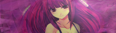
note: i've changed my text from soul to a small S, i did this so i could hide it easier and still not be ripped:P
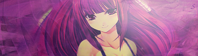
Message edited by soul - Thursday, 09 Sep 2010, 7:01 PM
 
HIKOMASHUDate: Thursday, 09 Sep 2010, 7:05 PM | Message # 2
Full-Timer
Messages: 291
Load ...
Status: Offline
wow soul,this sig is very good.Its blended good.The lighting,idk where it is,and the render is good

 
soulDate: Thursday, 09 Sep 2010, 7:11 PM | Message # 3
Part-Timer
Messages: 124
Load ...
Status: Offline
the lighting is top right of her head :D... i didnt know how to make the lighting stronger but still have that dark purple and pink effect that i gave her with a gradient map so yeah had to make not alot of light so it would flow cool
 
MrJigglesDate: Thursday, 09 Sep 2010, 7:33 PM | Message # 4
Full-Timer
Messages: 430
Load ...
Status: Offline
Well the text is Realy blended and it took me alittle bit to find it also you still want it to me near the focal and for the rest of the tag it has a little bit of depth and it looks like the focal is just in a random abstract thing.

This is how i do stuff now.

Depth- I use the blur tool to make stuff is far away and sharpen to make it look alot closer but make sure you dont sharpen too much or it will look bad and pixly also if you want it to look a little bit more dramatic you could burn the out side of the tag.

Lighting- I now use the dodge tool to make it light and burn to make it look darker.


I trust everyone, just not the devil inside of them.

 
soulDate: Thursday, 09 Sep 2010, 8:48 PM | Message # 5
Part-Timer
Messages: 124
Load ...
Status: Offline
okay guys heres another version more light and a italy smooth gradient map on low opacity v2

Added (09 Sep 2010, 8:48 PM)
---------------------------------------------
which one better :D?

 
HIKOMASHUDate: Thursday, 09 Sep 2010, 9:24 PM | Message # 6
Full-Timer
Messages: 291
Load ...
Status: Offline
i like the second one but you should lower the opacity on the lighting...its messing up the sig

 
AtomicFlameDate: Thursday, 09 Sep 2010, 10:36 PM | Message # 7
Full-Timer
Messages: 468
Load ...
Status: Offline
Even though you spent a long time on it, it looks monotone and flat to me. I would have tried to change her skin tone and warm it up because it almost looks like a light green. It needs more than just the render and the smudged background. If the text is that small you can get rid of it. sniper One thing you could do to enhance the lighting is to add shadows with a soft brush of black @ a low opacity around the spots the light isn't at so its almost like a mini vignette.

Don't stop there. Check out some of our tutorials.


Embedded vimeo videos will not play in HD because I don't have a paid account on vimeo. Click on the HD button to view the video in HD on vimeo's site if you so choose to do so.


Forum » Showrooms » GFX Show Off » okay guys (:O)
  • Page 1 of 1
  • 1
Search:

Group Legend: [Administrator] [Moderator] [Member] [Banned]