|
Vader
|
|
|
| Eruption | Date: Sunday, 19 Sep 2010, 8:06 PM | Message # 1 |
 Part-Timer
Messages: 130
Load ...
Status: Offline
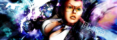
| V1-  V2- I personally like V1 better.
|
| |
| |
|
| AtomicFlame | Date: Sunday, 19 Sep 2010, 8:18 PM | Message # 2 |
 Full-Timer
Messages: 468
Load ...
Status: Offline
| Both are really good. Background is very good.
Embedded vimeo videos will not play in HD because I don't have a paid account on vimeo. Click on the HD button to view the video in HD on vimeo's site if you so choose to do so. 

|
| |
| |
|
| Eruption | Date: Sunday, 19 Sep 2010, 8:20 PM | Message # 3 |
|
Part-Timer
Messages: 130
Load ...
Status: Offline
| The original background was horrible so i pulled out an old c4d i still had from my previous sigs and smudged it on there a little bit with an opacity of 20 or so. but thanx! 
|
| |
| |
|
| DoudyxXxDubs | Date: Sunday, 19 Sep 2010, 8:21 PM | Message # 4 |
 Legendary
Messages: 1010
Load ...
Status: Offline
| o-
ver-
used-
ren-
der Hand seems a little too blurry to me...my nearsight aint that bad... It's alright for a monochromatic sig.

|
| |
| |
|
| Eruption | Date: Sunday, 19 Sep 2010, 8:25 PM | Message # 5 |
|
Part-Timer
Messages: 130
Load ...
Status: Offline
| i did blur the hand just a little bit just to blend it in a little bit and to look more realistic so that it looks like im focusing in on the main body of the render
|
| |
| |
|
| Mariah | Date: Monday, 20 Sep 2010, 1:51 AM | Message # 6 |
 Distinguished
Messages: 666
Load ...
Status: Offline
| yeah, I just would have removed the hand totally if I was gonna blur it. Very good though Eruption, the only thing I would change is the text. It's way too far away from the focal point and my eyes are drawn to the text instead. Not bad though. 
 

Thanks DoudyxXxDubs for the awesome b-day sig!
|
| |
| |
|
| Eruption | Date: Monday, 20 Sep 2010, 3:36 PM | Message # 7 |
|
Part-Timer
Messages: 130
Load ...
Status: Offline
| Quote (Eruption) Very good though Eruption, the only thing I would change is the text. It's way too far away from the focal point and my eyes are drawn to the text instead. whah... my eyes are drawn to vaders shiny helmet
|
| |
| |
|
| Denial | Date: Monday, 20 Sep 2010, 8:11 PM | Message # 8 |
 Full-Timer
Messages: 305
Load ...
Status: Offline
| V1 is better IMO and i like the background, and my eyesight is like the worst out of all Texas.. 2year ago when i went to get my new glasses i had -10, so now i probably have like -15 haha
|
| |
| |
|
| IKilledYou | Date: Monday, 20 Sep 2010, 8:22 PM | Message # 9 |
 Full-Timer
Messages: 381
Load ...
Status: Offline
| both r terrible im sorry render is over blended, that render is also overused and the effects r random no flow at all sorry :/ try bluring the render less for now use that render but dont ever use it again and make ur effcts flow with teh render


Message edited by IKilledYou - Monday, 20 Sep 2010, 8:25 PM |
| |
| |
|
| BlitzKrieg | Date: Monday, 20 Sep 2010, 8:30 PM | Message # 10 |
 Full-Timer
Messages: 311
Load ...
Status: Offline
| Quote I think you should've made his hand the focal. Teddy bears.
WTFLMAO
Smudgies <3

Message edited by BlitzKrieg - Tuesday, 21 Sep 2010, 5:35 PM |
| |
| |
|
| Siphenz | Date: Tuesday, 21 Sep 2010, 2:44 PM | Message # 11 |
 The Hitokiri
Messages: 384
Load ...
Status: Offline
| Myself, I like this one. I do think you did overblend (or smudge) the render in some areas like the right side of his helmet. Also there is a part of the hand that you missed and I feel like you overdid that as well. You also smudged out his entire right shoulder. For the hand... Next time just make new render layer and gauss blur (dont go over 4) andjust erase what you don't want blurred. Takes some time but will work better for what you were trying to achieve. The text... if you're going to put it in the corner or off to the side it needs to be much more subtle so that it does not draw so much attention away from what people should be looking at. This is a pretty cool sig I think... over-used render or not... <- that's retarded by the way. You just messed up on some parts, you had good ideas tho. b&w is better by a mile btw

|
| |
| |
|
| BlitzKrieg | Date: Tuesday, 21 Sep 2010, 5:36 PM | Message # 12 |
|
Full-Timer
Messages: 311
Load ...
Status: Offline
| Quote (BlitzKrieg) I think you should've made his hand the focal. Teddy bears. WTFLMAO
LMAFAOLOLROFL
Smudgies <3
|
| |
| |
|
| DoudyxXxDubs | Date: Tuesday, 21 Sep 2010, 5:55 PM | Message # 13 |
|
Legendary
Messages: 1010
Load ...
Status: Offline
| did someone hack you?
|
| |
| |
|
| BlitzKrieg | Date: Tuesday, 21 Sep 2010, 6:05 PM | Message # 14 |
|
Full-Timer
Messages: 311
Load ...
Status: Offline
| No,someone changed "boobies" to "teddy bears"in my last post
Smudgies <3
|
| |
| |
|
| HIKOMASHU | Date: Tuesday, 21 Sep 2010, 8:17 PM | Message # 15 |
|
Full-Timer
Messages: 291
Load ...
Status: Offline
| LMAO

|
| |
| |


